Wesgro is the promotions agency for the Western Cape government. Its mandate is to promote business and tourism in Cape Town and the Western Cape.
The project was briefed to Flow Communications as two separate websites – a tourist-facing website and a business-facing website. In interrogating the needs of the Wesgro team as well as the user groups, our recommendation was to build one multisite architecture platform that houses seven mini sites in one website, making use of the same URL: www.wesgro.co.za.
Objectives – tourist-facing website:
- Inspire potential travellers to create future demand for Cape Town and the Western Cape during the “dream” phase of travel
- Increase opportunities to see through the interplay between the website and social media platforms, and a high Google ranking through search engine optimisation (SEO)
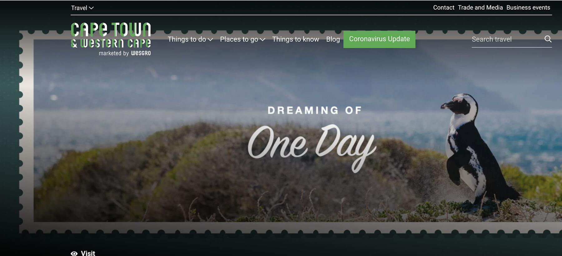
For the tourism website it was imperative that the design allowed for a visual online experience of the rich, diverse proposition that the Western Cape offers tourists.
Objectives – business-facing websites:
- Increase opportunities for increased traffic, as well as a higher dwell time and more page views
- Lead generation: Wesgro’s key performance indicators include metrics of interactions through queries that the team can answer to facilitate prospective business. Therefore, we needed to increase inquiry rates
- Finding information quickly and efficiently – Wesgro has a wealth of knowledge that needs to be accessed quickly and easily
For all the business-facing mini sites on the platform (namely Invest, Export, Convention Bureau, Film & Media and Air Access), it was important that we delivered a high standard of search functionality, as well as persuade users to make contact.
The principles for design and build were:
- The portal comprises a number of sites based on the different user groups and their needs
- The flat structure allows the user to access information quickly from Google and does not need to access content through only one “front door”, which may be confusing and overwhelming to a user
- Long-form, evergreen content is showcased as guides to answer users’ needs and questions (these, for example, include How to invest in the Western Cape, Cost of doing business in the Western Cape, and How to export from the Western Cape)
- Strong calls to action to get in touch are placed at strategic points when someone is looking through information
- Page templates are designed to follow a heavy, medium and light version based on content required. This ensured ease of use for Wesgro’s content developers long after the site went live
- The philosophy of “create once, publish everywhere” ensures that all content has a relevant home and can be indexed for search
- Elastic search is used to make sure that the search functionality is reactive and intuitive
Content
Each mini site features strong SEO-focused content that is relevant to the primary user group identified for that section.
Content was formulated around users’ needs and what questions they would be searching in Google, such as “How to invest in the Western Cape”. Long-form pages were built as guides to target these search terms. This content was written to be evergreen, and would not need updating very often.
The Travel and Convention Bureau mini sites were designed slightly differently, to be more visual and interactive. The look and feel makes use of large, impactful images and video that bleed off the screen, drawing the user into an immersive experience.
Creativity/innovation
At Flow Communications we pride ourselves on getting to the heart of the problem, not merely following a brief. In the strategy phase of work we interrogated the complexity of Wesgro’s business model, understanding who we needed to reach. We built a solution with these users at the heart of the decision-making process. A multisite architecture was the better solution to ensure more people visit the site, and access the information relevant to them quickly and easily.
This creative thinking stretched to the way we designed the user journey to serve up an experience to the user, rather than just reams of content for them to sift through. Our look and feel purposely included white space to make text more readable. We used different user experience (UX) components such as accordions, media blocks and icons to break up text into bite-sized chunks.
Atomic-based design system
Instead of developing each page according to a layout design, we broke this into components. We built a component library, which ensured consistency. This approach also allows for new mini sites to be added easily and efficiently.
Trip planner
In order to draw in the potential traveller to the Western Cape, we built an interactive “bucket list” tool that enables the user to mark any experience or destination and add it to their personalised list. This can then be saved for future travel plans.
Functionality
Multisite architecture
We built seven websites in one, all operating in a similar way and all built in one CMS environment.
User-centric
Through the design and content phases of work, all decisions were made based on how to answer users’ needs.
Migration
We changed our approach to migrating and wrote new scripts, which allowed us to pull large volumes of content from the old website into the new website.
Search
Our development team researched and mastered the best search tool to integrate with. The search functionality across the website needed to allow full-text, numerical and faceted search. Results needed to be delivered in real time from the first keystroke. We used Algolia search and integrated it seamlessly into the programming.
We also indexed text across all document types, so that all content can be included in search results.
Mapping
We made use of mapping tools that allow a higher level of design customisation than Google Maps, leading to a better user experience.
Results achieved
This website was a great milestone for Wesgro. Prior to this, its previous site was dormant for two years with few content updates and had very limited functionality.
The website now has:
- Over 2 000 rich content pages with instantly available resources thanks to a dynamic search console that returns results in less than 200ms
- Custom sets of functionality that aide the business workflows, including an event-planner workflow for conference organisers and a 3D tour of the One Stop Shop (for prospective investors to see all the business facilities under one roof)
- Guides to every corner of the Western Cape for both travellers and business investors
- An integrated control panel to manage content for all websites in a single location
- A strong brand component library built on atomic web principles to ensure brand consistency
The website was showcased at the Wesgro Annual Review event. The feedback was overwhelmingly positive, with the new website really positioning Wesgro as a leader among its peers.
The new Wesgro website has also delivered against the objectives set out at the beginning of the project.
It has increased opportunities to see with good ranking on Google, as well as an average of 7 700 unique visitors a month. Prior to the new site, the old site had virtually no traffic.
As content seeded into search engines we saw a steady growth of the website since its launch in November 2019. This traffic is purely organic with no paid media in place due to budget restrictions.
Traffic from launch until May 2020:

Google ranking:
- Our long-form guide on doing business in the Western Cape appeared at number one when searching “doing business in the Western Cape”
- The Invest mini site ranked second on Google for “investing in the Western Cape”
- The Export mini site ranked second on Google for the search term “exporting from the Western Cape”
The site also had visits from lead markets outside South Africa, with over 12% of visitors coming from the United States.
Wesgro’s performance is measured on direct opportunities to promote business in the Western Cape. The new website has become an important channel to answer questions, and provide advice or facilitate business opportunities. The site sees an average of 77 business leads per month. Prior to the new site, Wesgro did not receive any leads via its website.
Visitors spend on average two minutes on the site and view an average of 2.15 pages in a session. This indicates that organic search is sending users directly to content relevant to their search. Our guides, such as “Doing business in the Western Cape” and “Investing in the Western Cape”, regularly receive direct traffic from Google, which means that content is answering visitors’ needs for information.
Navigation
In the design of the site it was crucial that the user didn’t get lost or overwhelmed by the complexity of Wesgro’s structure. There is a mix of B2C and B2B users and if the user is a tourist exploring the site, it could be off-putting to come across content that is aimed at business people or investors.
Our solution to this is a global navigation, which gives the user control over which website they want to access through a single click.
This allowed us to keep the main navigation of each mini site simple and uncluttered.

We use colour coding to ensure users differentiate between the tourism (green) and business (blue) mini sites.


