Cape Town’s Two Oceans Aquarium is one of the top tourist attractions in the city. Now in its 20th year, a major expansion is taking place that will include a brand-new shark exhibit, a walk-through tunnel, an event space and more.
But it’s not only their physical site that has been undergoing construction. Flow Communications has been working on their new website, which launched last week.

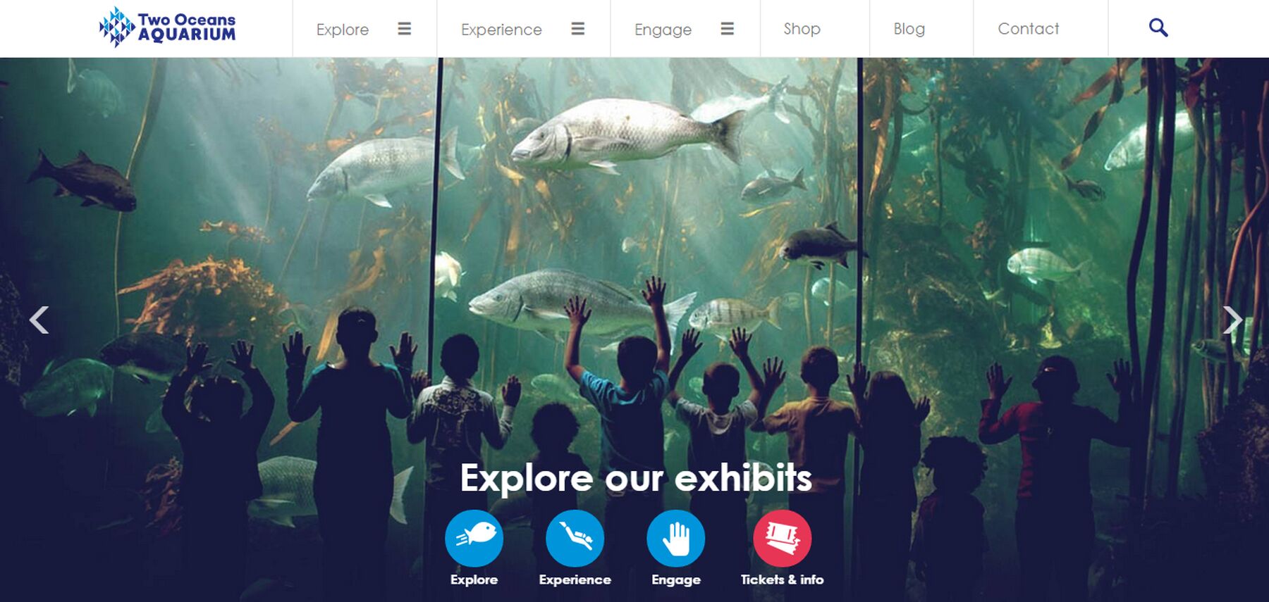
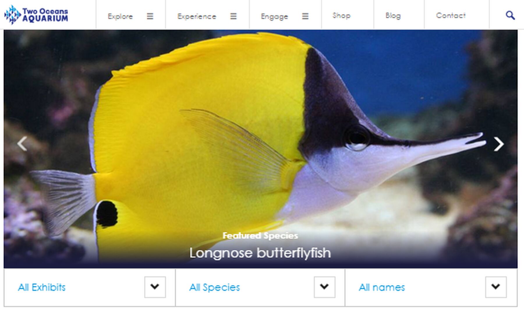
www.aquarium.co.za has undergone several major changes, with a big emphasis on beautiful imagery. Each exhibit has its own page, each with a photo gallery.
Flow took the Aquarium's slogan – Explore, Experience, Engage – and made it a part of the website. "Explore" will provide you with all the basic info you need about the Aquarium: ticket prices, opening hours, where to eat, where to park, and which animals you'll find there.

"Experience" lists all the activities in which you can become involved, from joining a school group, to watching a penguin feed, to going on a boat ride around Table Bay or even diving with ragged-tooth sharks!
The "Engage" section details ways you can further interact with the Aquarium. You can sign up for Aquarium membership, become a volunteer, make a donation or support one of their environmental campaigns. Their conservation and sustainability work is also listed here.
The latest news, as always, can be found on the blog.
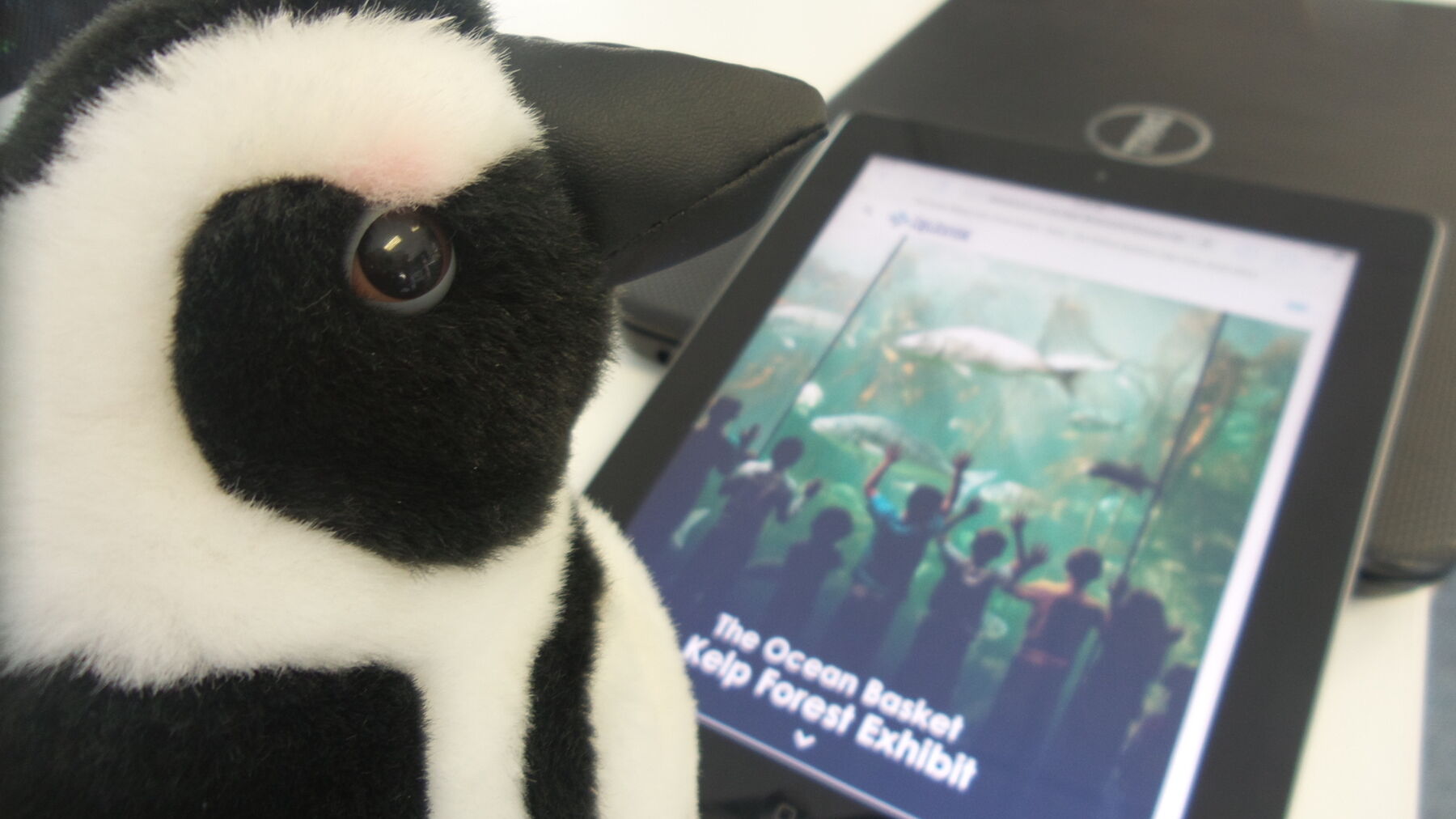
This upgrade has ensured that the website is compatible with mobile devices. The pages are now "responsive", and will resize themselves to suit whatever screen you are viewing them on, whether a cellphone, tablet or desktop computer.
"We are so excited about the new look of our website," says the Aquarium's marketing manager, Alichia Nortje. "We believe our visitors will thoroughly enjoy the innovative design, especially the beautiful imagery that now dominates the site. The revised layout is fresh, easy to use and fully responsive, which means that you'll experience the best of our website regardless of the device you use."
Of course, buying tickets is still central to the process, and by visiting the online shop, you can purchase yours at 10% cheaper than the ticket office price.
"Well done to the team for a good-looking site," says Flow's development studio manager, Reatile Tshikalange. Darren Caboz was the chief developer for the project, and worked alongside Flowstar designer Ryan Levenson and content producer Stuart Buchanan. Project manager Leanne Pohlmann oversaw the process.

"We wanted users to feel as excited when visiting the site as we get when visiting the aquarium," says Ryan. "It's a designer's dream to work on this site, it looks fantastic and was the most fun I have had designing."
Go and sea it for yourself – www.aquarium.co.za.


